Natural - Artifical
Original - Copy
Interior to the mind - Exterior to the mind
Aural (heard) - Visual (read)
Ephemeral - Permanent
No equipment - Requires equipment
Dialogue - Monologue
Wednesday, 27 May 2009
Capital Letters
Capital ("Caps"/"Upper-Case") letters are principally constructed between two parallel lines: the base line and the cap height.
Small Capitals (Small Caps)
Some fonts contain small caps, capital lettersforms that are designed to work optically with lower case. They are generally a litle higher tahn the x-height.
Capital - use of
The use of Capitals is a complicated issue. The rule in English is that all proper names should begin with a acapital, and there is the common practice tahat within titles all words other than 'the' 'and' 'of', etc should also start likewise. However, the latter practice can make titles look ugly and many cases old fashioned.
Business Card Idea
To use a section of the image used for the catalogue to create my business card, this way it all follows a theme, and shows a link to work that will be on display.
I will have the following contact detail on the reverse of the card:
Name: Leanne Hill
Email:bublea1988@yahoo.co.uk
Blog:Leannesmhill.blogspot.com
Contact No.: 07908774556
I will have the following contact detail on the reverse of the card:
Name: Leanne Hill
Email:bublea1988@yahoo.co.uk
Blog:Leannesmhill.blogspot.com
Contact No.: 07908774556
Monday, 11 May 2009
Friday, 8 May 2009
ABORTION IS A PERSONAL CHOICE AND I BELIEVE IT SHOULD BE LEFT WITH THE INDIVIDUAL CONCERNED. AS INDIVIDUALS WE HAVE THE RIGHT TO CHOOSE AND SHOULD NOT BE JUDGED UNFAIRLY FOR MAKING THIS DIFFICULT DECISION. FOR WHATEVER REASON WE CHOOSE, THE RIGHT TO ABORT IT IS NOT DONE WITHOUT REMORSE. AN UNPLANNED PREGNANCY CAN BRING AS MUCH DESPAIR AS JOY TO US AND AN ABORTION MAY BE THE ONLY POSITIVE DECISION WE CAN COME TO. I FEEL THAT THERE ARE MANY REASONS WE CHOOSE THE RIGHT TO ABORT LIFE, ALTHOUGH THE MAJORITY SEEM TO FALL BETWEEN FAILED CONTRACEPTION, RAPE, AND THREAT TO LIFE – MOTHER OR CHILD, SOCIAL OR FINANCIAL PROBLEMS. IF YOU ARE SOMEONE THAT THINKS OF ABORTION AS MURDER, I AM NOT TRYING TO CHANGE YOUR OPINION OR JUSTIFY A WOMANS RIGHT TO ABORT, AS I DON’T FEEL THAT JUSTIFICATION IS REQUIRED. I AM ONLY HIGHLIGHTING THE FACT THAT THERE IS A BIGGER PICTURE IN MOST CASES WHEN MAKING THIS DECISION.
Thursday, 7 May 2009
Tuesday, 21 April 2009
Monday, 30 March 2009
Strine and Fraffly
Strine (Australian)
Yeppet yousha nut.
Ifer gotta natter
speak Fraffly.
Ipey nwirkin
forpa fesser Lauder,
a nair wiker nony
talk Strine.
It kinder getcher,
few Noah timene.
Fried eye car nelpew
Fraffly (posh English)
Well, dibboy,
wimce trair little hodder.
A noshol we tray
wan smore?
Reddeh? Repee tofter me:
The wren in Spen
in mennleh in the
pline.
Ir, fraffly sorreh,
Emmean the wren
is in the plen
Vernacular
Vernacular refers to the native language of a country or a locality. In general linguistics, it is used to describe local languages as opposed to linguas franca, official standards or global languages. It is sometimes applied to nonstandard dialects of a global language.
ver⋅nac⋅u⋅lar = [ver-nak-yuh-ler, vuh-nak-]
–adjective
1. (of language) native or indigenous (opposed to literary or learned ).
2. expressed or written in the native language of a place, as literary works: a vernacular poem.
3. using such a language: a vernacular speaker.
4. of or pertaining to such a language.
5. using plain, everyday, ordinary language.
6. of, pertaining to, or characteristic of architectural vernacular.
7. noting or pertaining to the common name for a plant or animal.
8. Obsolete. (of a disease) endemic.
–noun
9. the native speech or language of a place.
10. the language or vocabulary peculiar to a class or profession.
11. a vernacular word or expression.
12. the plain variety of language in everyday use by ordinary people.
13. the common name of an animal or plant as distinguished from its Latin scientific name.
14. a style of architecture exemplifying the commonest techniques, decorative features, and materials of a particular historical period, region, or group of people.
15. any medium or mode of expression that reflects popular taste or indigenous styles.
Phonetics
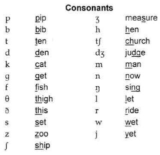
I am researching how words sound and how people speak differently. Phonics has its own symbols for each off the sounds.
Monday, 23 March 2009
Typographical features
There are many elements in the design of a typeface which can contribute to its legibility.
Serif / Sans Serif
"Serifs" are the small finishing strokes on the end of a character. "Sans serif" fonts do not have these small finishing strokes.
Figure 1
Examples of serif and sans serif letters
Point size
Point size is perhaps the element most used to describe the legibility of a type face, but it can also be the most deceptive. Point size is a legacy from the letterpress system, where each letter is held on a small metal block. The point size actually refers to the size of this metal block, and not the actual size of the letter. The letter does not have to take up the full area of the block face, so two fonts with the same nominal point size can quite easily have different actual sizes. ( Bix, 2002)
Figure 2
The difference between point size and actual letter size (Image © Bix, 2002 )
X-height
X-height refers to the height of the lower case "x" in a typeface. It is often a better indicator of the apparent size of a typeface than point size ( Poulton, 1972 ; Bix, 2002 ).
Figure 3
X-height
Counters
Counters are the "negative spaces" inside a character. They are also good indicators of the actual size of the type.
Figure 4
Counters
Ascenders and descenders
Ascenders and are the vertical strokes which rise above the body of a character or x-height. Descenders are strokes which fall below the baseline of the x-height.
Sunday, 1 March 2009
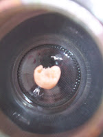
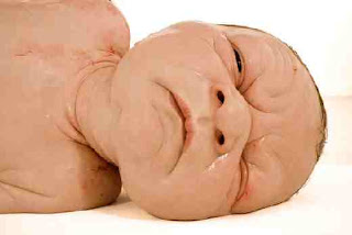
Researching the development of a baby, i have uploaded the weekly stages that i am going to imitate into real life models. The stages of pregnancy i have uploaded, i will recreate and sculpt using modelling wax.
Bodyworlds book has detailed images, as scanned above, from what i will work from to create each detail.
Bodyworlds book has detailed images, as scanned above, from what i will work from to create each detail.
Wednesday, 25 February 2009
Subscribe to:
Comments (Atom)


